Delve Withrington is a designer & artist. Delve has designed type at FontShop and Monotype Imaging and has worked with master type designers including Sumner Stone and Robin Nicholas. When he’s not busy doing custom work for clients like Red Hat and Veer, he is focused on his foundry — Delve Fonts. We got together to talk about the growth of Delve Fonts, where to find good barbeque, collaboration, inspiration, and one of his latest font releases; Helfa.
More, so much more to see at the Delve Fonts website.
Following are the web-only excerpts from our interview with Delve. Get your hands on the printed issue to read the interview in it’s entirety.
What do you think is the ideal use for Helfa?
“Primarily for print, at least for the initial release. I plan to do additional versions of it for titling, a version for captioning, a grid-fitted weight or two for small sizes on-screen, things like that so it can be called on for almost any job.”
How do you critique your own work?
“Oh, goodness. I am my own worst critic, of course. I will print types out in a range of sizes, from a body of copy around 8pt to large individual glyphs filling a single page. These I view up close, from a distance, upside down, and so on, in order to reveal any flaws. Taking frequent breaks to kind of give my eyes a rest and think about something else a while helps. Then I come back to it with fresh eyes — maybe the next day or later — and look at those forms again, carefully considering what works and what doesn’t. What is it doing on the page in a group setting — how does it function at a large size; does it still hold appeal? Is it still interesting to look at? Trying to achieve that balance is kind of tricky.
I do rely on other people for feedback too, which is not always easy because some folks are willing to give you an honest opinion or take time to provide some constructive criticism while others will look at it and say: “It’s nice.”, and that’s the end of it. For an artist, that is not unusual. I’ve experienced that showing my work in galleries. You usually just don’t have the benefit of hearing an honest critique. If you’re in art school, or you go to a crit session with a group of other artists, you can get that sort of invaluable feedback. So I do seek that out because it’s hard working by yourself; forest through the trees and all.”
How do you know what to keep and what to ditch?
“I want the design to be distinctive — so I let my imagination dictate the first version, pulling from all the possible combinations of features available or even try to invent something new. Eventually, I set them up in strings of text and look at them together to see which are weirdest. Which ones interfere with reading the most? Take them out and change them; repeat that process making refinements until, at some point I start to see that there’s not really much in the way of color or characteristics that are out of place or interfering with the reading. When editing other designer’s typefaces, I almost work backwards: First I carefully consider their existing design, and then suggest refinements or other possibilities.”
When you say ‘color’, do you mean the positive space?
“By color, I mean consistency of the optical weight — the density of text on the page. Ideally, it is even all the way through. Examples of typical concerns regarding color (on the level of an individual glyph) are optical massing, where two or more strokes join together, ‘B’, ‘K’, and ‘R’ for instance (in some designs), or a feature that’s too large or heavy. Trying to achieve harmony among all the shapes in weight and in contrast. The goal being that they form a consistent color of gray on the page, when set correctly.
When I look at a letterform, I see the positive and negative shapes within it. The negative shapes should be just as pleasing to the eye as the positive ones since they are interdependent and work together in harmony. Then I step back and consider how this particular glyph fits with all the others in a design and perhaps go back in and make changes that will help it marry with the other glyphs. It’s a non-linear process.”
“In some instances it’s a challenge to be consistent in a type design. Another thing I try to look out for that I struggle with is in addition to proportion, is stress on a curve. For example, sometimes it’s difficult to find it because it’s an elusive thing. It’s not a mathematical formula; it’s art. It’s not like you can say: “On this round, if I adjust the weight by 10 units, that it’s going to work the same on the next letter form because it usually won’t; it’s got a different layout.”
Do you feel typographic design has kept up with typographic technology?
“What’s interesting, I think, are how the different technologies used to display type have influenced type design. For example, CRT televisions needed type that had thicker horizontal strokes, so at smaller sizes the strokes and some features wouldn’t drop out because of the alternating scan lines. Look at typefaces like Courier, OCR-A, Officina, Matrix, Verdana — those designs were shaped by the technology of their time. Technology made type possible. From ink traps to grid-fitting, evolution in type, the aesthetics of it, the presentation of it, the production, and the use of it, has gone hand-in-hand with technological advancement.”
“There was a friend of mine that said that they felt that each designer has one typeface within them and they keep doing variations on it. And I’ve heard some people respond, saying: “that’s complete b.s.”, but I think there’s a little bit of truth in that because as an individual you can experiment and you can be as creative as you want to but ultimately you are who you are and there are certain parameters — no matter how far you push yourself — certain things you just wouldn’t think of — that other people would.”
What do you think makes for a good typeface in design and in technical detail?
“On a technical level, I think it should, of course, be error-free. There shouldn’t be anything in it that could cause problems for the user. If you expect people to pay for a product like that, you better have made it something solid. I think it behooves a type designer such as myself, too make a font as error-free as possible. There will be less customer support to do. I mean, if you leave all these glitches in there, then yeah, somebody’s going to have a problem with it and you’re going to get calls for it to be fixed. I am thankful to have the experience and knowledge now to build typefaces that are reliable like that.”
“Personally, I think originality in design. It doesn’t have to be crazy; it doesn’t have to be something so weird that people can’t connect with it. There has to be some humanity in there after all, some personal idiosyncrasies or things that people can kind of relate to or connect with. I think keeping it real — keeping it human is part of what makes a good design.”
-
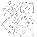
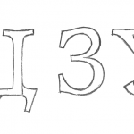
- Arabic Numerals
-
- Detail from “Eucalyptus”

-
- Detail from “Eucalyptus”

-
- Detail from “Eucalyptus”

-
- Detail from “Eucalyptus”

-
- Helfa Cyrillic

-

- Helfa Cyrillic

-

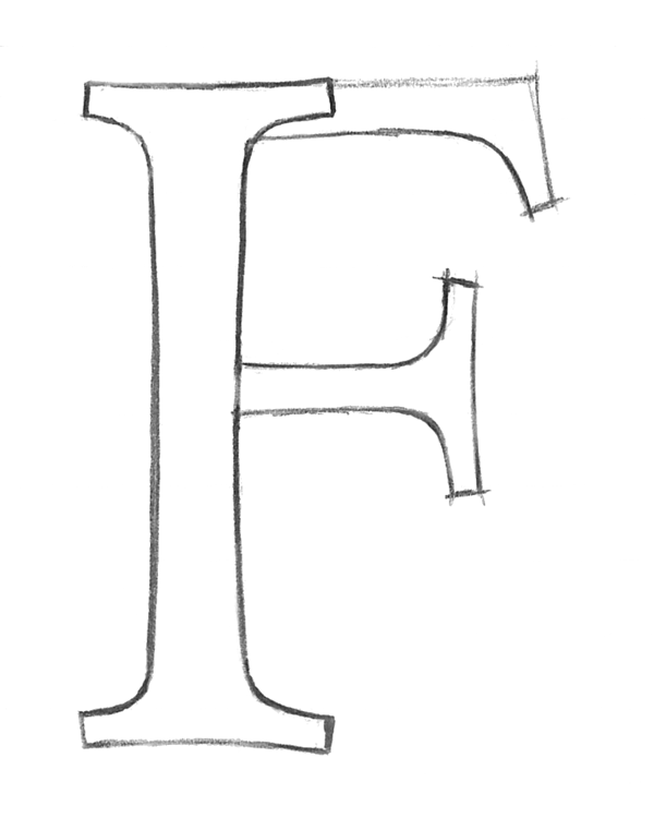
- Helfa F
-

- Helfa Greek

-

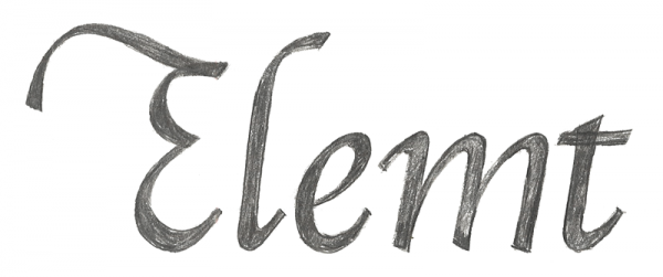
- Helfa Italic
-
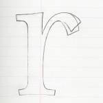
- Helfa r

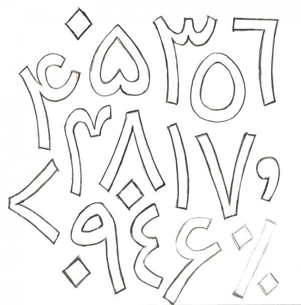
-

- Slab Serif Sketch

-
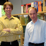
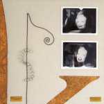
- Delve and Robin Nicholas

With the invention of OpenType and WebFonts, in recent history, do you feel like we are living in the ‘golden age’ of typography?
“I don’t know if I’d label it as ‘golden age’. I think that it’s certainly enjoying a renaissance of sorts because it’s first of all — with personal computers being so cheap and accessible now and with software like FontLab being relatively affordable for the individual — and there’s Font Forge; which is on par with FontLab, and it’s free — the software and the hardware are there for anybody who has the mind to do it and hopefully the skill and the wherewithal to stick with it and make something good. And the talent of course.”
“I think there’s kind of a renaissance in those terms — that it hasn’t been that accessible before and so what you’re seeing is kind of an explosion in new designs coming out and new ideas being done in type that may have not otherwise been done. I kind of think that I would have fallen into type even if I hadn’t had a computer at my disposal. I was playing around with it. I was working at a print shop, and then working at a publisher and all this was before computers.“
“I just didn’t know it was a vocation. That you could do that…until I was 21, and then it just dawned on me. ‘Oh wow, you can actually just start doing this!’ Pretty naive of me, but that’s how it happened.”
“I was working at an architectural signage company and taking fonts apart with Fontographer; in order to adapt them for the machines that we were using to produce letterforms for signage — so I was deconstructing type.”
“I was learning how to put them together by taking them apart. We were licensed for these typefaces. We had to produce a sign with them. At the time, the signage software couldn’t use the fonts as they were. We had to either stroke them; put an outline around them — for say, a router bit path…or I had to add a line here or there…or change the direction of the line; the winding order — So there were all kinds of things I had to do to them to get them to work with the machines we had. I was a lot of fun and that’s how I actually got into designing them on the computer. That was between ’92 and ’96.”
“During that time, I produced Continuo. That was the first one that I finished up like that as a digital font. There were other ones that I had drawings for that I didn’t finish or didn’t release; that’s true even today. I’ll still sketch stuff and I don’t necessarily do anything with it. Get an idea and explore it — and then shelve it for a while. Which, I think is wise to do (laughing); you know because you come back to it 6 months later and you’re like ‘Oh, that’s cool — I really should follow up on that’ or 6 months later you pull it out and you go ‘What was I thinking — I better burn this before anybody else sees it!’ Whatever — I think I do keep everything — ‘cause you never know…it’s hard to know what might inspire other ideas in the future.”
P.S. Darn good bbq can be found in Alameda, CA at Great American Barebecue ~Ed.